<!DOCTYPE html>
<html>
<head>
<style>
* {
box-sizing: border-box;
}
body {
font-family: Arial;
padding: 10px;
background: #f1f1f1;
}
/* Header/Blog Title */
.header {
padding: 30px;
text-align: center;
background: white;
}
.header h1 {
font-size: 50px;
}
/* Style the top navigation bar */
.topnav {
overflow: hidden;
background-color: #333;
}
/* Style the topnav links */
.topnav a {
float: left;
display: block;
color: #f2f2f2;
text-align: center;
padding: 14px 16px;
text-decoration: none;
}
/* Change color on hover */
.topnav a:hover {
background-color: #ddd;
color: black;
}
/* Create two unequal columns that floats next to each other */
/* Left column */
.leftcolumn {
float: left;
width: 75%;
}
/* Right column */
.rightcolumn {
float: left;
width: 25%;
background-color: #f1f1f1;
padding-left: 20px;
}
/* Fake image */
.fakeimg {
background-color: #aaa;
width: 100%;
padding: 20px;
}
/* Add a card effect for articles */
.card {
background-color: white;
padding: 20px;
margin-top: 20px;
}
/* Clear floats after the columns */
.row:after {
content: "";
display: table;
clear: both;
}
/* Footer */
.footer {
padding: 20px;
text-align: center;
background: #ddd;
margin-top: 20px;
}
/* Responsive layout - when the screen is less than 800px wide, make the two columns stack on top of each other instead of next to each other */
@media screen and (max-width: 800px) {
.leftcolumn, .rightcolumn {
width: 100%;
padding: 0;
}
}
/* Responsive layout - when the screen is less than 400px wide, make the navigation links stack on top of each other instead of next to each other */
@media screen and (max-width: 400px) {
.topnav a {
float: none;
width: 100%;
}
}
</style>
</head>
<body>
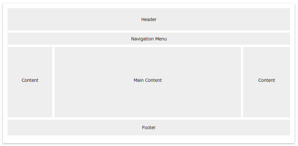
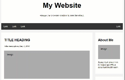
<div class="header">
<h1>My Website</h1>
<p>Resize the browser window to see the effect.</p>
</div>
<div class="topnav">
<a href="#">Link</a>
<a href="#">Link</a>
<a href="#">Link</a>
<a href="#" style="float:right">Link</a>
</div>
<div class="row">
<div class="leftcolumn">
<div class="card">
<h2>TITLE HEADING</h2>
<h5>Title description, Dec 7, 2017</h5>
<div class="fakeimg" style="height:200px;">Image</div>
<p>Some text..</p>
<p>Sunt in culpa qui officia deserunt mollit anim id est laborum consectetur adipiscing elit, sed do eiusmod tempor incididunt ut labore et dolore magna aliqua. Ut enim ad minim veniam, quis nostrud exercitation ullamco.</p>
</div>
<div class="card">
<h2>TITLE HEADING</h2>
<h5>Title description, Sep 2, 2017</h5>
<div class="fakeimg" style="height:200px;">Image</div>
<p>Some text..</p>
<p>Sunt in culpa qui officia deserunt mollit anim id est laborum consectetur adipiscing elit, sed do eiusmod tempor incididunt ut labore et dolore magna aliqua. Ut enim ad minim veniam, quis nostrud exercitation ullamco.</p>
</div>
</div>
<div class="rightcolumn">
<div class="card">
<h2>About Me</h2>
<div class="fakeimg" style="height:100px;">Image</div>
<p>Some text about me in culpa qui officia deserunt mollit anim..</p>
</div>
<div class="card">
<h3>Popular Post</h3>
<div class="fakeimg"><p>Image</p></div>
<div class="fakeimg"><p>Image</p></div>
<div class="fakeimg"><p>Image</p></div>
</div>
<div class="card">
<h3>Follow Me</h3>
<p>Some text..</p>
</div>
</div>
</div>
<div class="footer">
<h2>Footer</h2>
</div>
</body>
</html>
 فروشگاه
 فیلم های آموزشی
 کتاب های آموزشی
 مقالات آموزشی
 وردپرس


Mahdi
سلام بسیار عالی بود موفق باشید 🙂