مقدمه
با عرض سلام و وقت بخیر خدمت کاربران سایت پی وی لرن . و کاربرانی که دوره کامل آموزش CSS را دنبال می کنند. در جلسه ی قبل شما را با مفاهیم ، ساختار اصلی و نحوه ی بکارگیری Media Querie در CSS آشنا کردیم. اما Media Querie ها در شکل ها و حالت های مختلف استفاده می شوند و دامنه ی کاربرد وسیعی در CSS دارند به همین منظور برای درک بهتر عملکردهای Media Querie در CSS و موارد استفاده از آن این جلسه را به بررسی مثال هایی از Media Querie اختصاص داده ایم.
مثال هایی از Media Querie
در ابتدا به بررسی مثال هایی از Media Querie که ساده هستند پرداخته، سپس مثال های کامل تری را بررسی می کنیم.
مثال ساده از Media Querie
مثال : یک مثال ساده
1 2 3 4 5 6 7 8 9 10 11 12 13 14 15 16 17 18 | /* Set the background color of body to tan */ body { background-color: tan; } /* On screens that are 992px or less, set the background color to blue */ @media screen and (max-width: 992px) { body { background-color: blue; } } /* On screens that are 600px or less, set the background color to olive */ @media screen and (max-width: 600px) { body { background-color: olive; } } |
Media Querie برای منو
در این مثال ما از media querie برای ایجاد یک منوی navigation با قابلیت Responsive استفاده می کنیم.
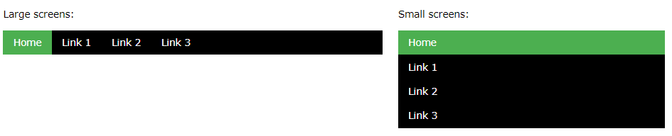
مثال هایی از Media Querie – منوی responsive
مثال : منوی رسپانسیو
1 2 3 4 5 6 7 8 9 10 11 12 13 14 15 16 17 18 19 20 21 22 23 | /* The navbar container */ .topnav { overflow: hidden; background-color: #333; } /* Navbar links */ .topnav a { float: left; display: block; color: white; text-align: center; padding: 14px 16px; text-decoration: none; } /* On screens that are 600px wide or less, make the menu links stack on top of each other instead of next to each other */ @media screen and (max-width: 600px) { .topnav a { float: none; width: 100%; } } |
media querie برای ستون ها
رایج ترین استفاده از media querie ها ایجاد یک طرح html انعطاف پذیر یا responsive است.
در مثال زیر یک طرح ساده از ۴ ستون ایجاد کرده یم که در اندازه های مختلف مرورگر بین ۴ و ۲ و ۱ ستون تغییر می کند:
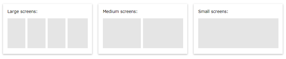
مثال هایی از Media Querie -ستون های انعطاف پذیر
مثال : ستون های رسپانسیو
1 2 3 4 5 6 7 8 9 10 11 12 13 14 15 16 17 18 19 | /* Create four equal columns that floats next to each other */ .column { float: left; width: 25%; } /* On screens that are 992px wide or less, go from four columns to two columns */ @media screen and (max-width: 992px) { .column { width: 50%; } } /* On screens that are 600px wide or less, make the columns stack on top of each other instead of next to each other */ @media screen and (max-width: 600px) { .column { width: 100%; } } |
: روش مدرن طراحی ستون های انعطاف پذیر استفاده از ویژگی Flexbox است.
با این وجود این ویژگی در مرورگرهای اینترنت اکسپلورر۱۰ و نسخه های قدیمی تر آن پشتیبانی نمی شود.
برای مرورگرهای فوق بهتر است که از ویژگی float استفاده کنید.
مثال : قابلیت Flex
1 2 3 4 5 6 7 8 9 10 11 12 13 14 15 16 17 18 19 20 21 22 23 24 25 | /* Container for flexboxes */ .row { display: flex; flex-wrap: wrap; } /* Create four equal columns */ .column { flex: 25%; padding: 20px; } /* On screens that are 992px wide or less, go from four columns to two columns */ @media screen and (max-width: 992px) { .column { flex: 50%; } } /* On screens that are 600px wide or less, make the columns stack on top of each other instead of next to each other */ @media screen and (max-width: 600px) { .row { flex-direction: column; } } |
مخفی کردن عناصر با media querie
یکی دیگر از کاربردهای رایج media querie مخفی کردن عناصر html است:
مثال : مخفی کردن عناصر html با media
| /* If the screen size is 600px wide or less, hide the element */ @media screen and (max-width: 600px) { div.example { display: none; } } |
تغییر دادن اندازه ی فونت در media querie
شما همچنین می توانید با استفاده از media querie اندازه ی متفاوتی از فونت را در دستگاه های مختلف اعمال کنید:
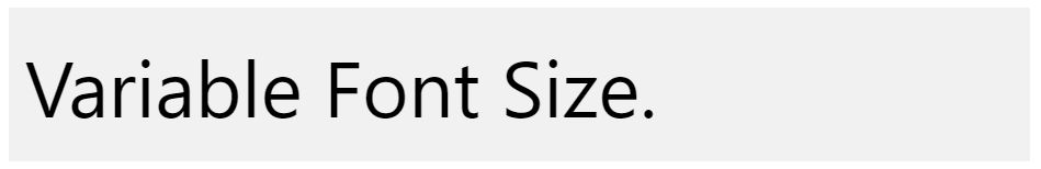
مثال هایی از Media Querie – اندازه ی فونت
مثال : فونت رسپانسیو
| /* If screen size is more than 600px wide, set the font-size of <div> to 80px */ @media screen and (min-width: 600px) { div.example { font-size: 80px; } } /* If screen size is 600px wide, or less, set the font-size of <div> to 30px */ @media screen and (max-width: 600px) { div.example { font-size: 30px; } } |
گالری عکس انعطاف پذیر
در مثال زیر با استفاده از media querie ها یک گالری عکس انعطاف پذیر را ایجاد کرده ایم:
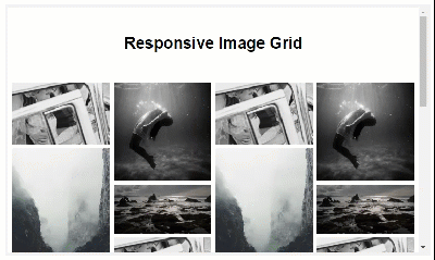
مثال هایی از Media Querie -گالری عکس انعطاف پذیر
مثال : گالری عکس رسپانسیو با Flex
1 2 3 4 5 6 7 8 9 10 11 12 13 14 15 16 17 18 19 20 21 22 23 24 25 26 27 28 29 30 31 32 33 34 35 36 37 38 39 40 41 42 43 44 45 46 47 48 49 50 51 52 53 54 55 56 57 58 59 60 61 62 63 64 65 66 67 68 69 70 71 72 73 74 75 76 77 78 79 80 81 82 83 84 85 86 87 88 89 90 91 92 93 94 95 96 97 98 99 100 101 102 | <!DOCTYPE html> <html> <style> * { box-sizing: border-box; } body { margin: 0; font-family: Arial; } .header { text-align: center; padding: 32px; } .row { display: flex; flex-wrap: wrap; padding: 0 4px; } /* Create four equal columns that sits next to each other */ .column { flex: 25%; max-width: 25%; padding: 0 4px; } .column img { margin-top: 8px; vertical-align: middle; } /* Responsive layout - makes a two column-layout instead of four columns */ @media screen and (max-width: 800px) { .column { flex: 50%; max-width: 50%; } } /* Responsive layout - makes the two columns stack on top of each other instead of next to each other */ @media screen and (max-width: 600px) { .column { flex: 100%; max-width: 100%; } } </style> <body> <!-- Header --> <div class="header"> <h1>Responsive Image Grid</h1> <p>Resize the browser window to see the responsive effect.</p> </div> <!-- Photo Grid --> <div class="row"> <div class="column"> <img src="/w3images/wedding.jpg" style="width:100%"> <img src="/w3images/rocks.jpg" style="width:100%"> <img src="/w3images/falls2.jpg" style="width:100%"> <img src="/w3images/paris.jpg" style="width:100%"> <img src="/w3images/nature.jpg" style="width:100%"> <img src="/w3images/mist.jpg" style="width:100%"> <img src="/w3images/paris.jpg" style="width:100%"> </div> <div class="column"> <img src="/w3images/underwater.jpg" style="width:100%"> <img src="/w3images/ocean.jpg" style="width:100%"> <img src="/w3images/wedding.jpg" style="width:100%"> <img src="/w3images/mountainskies.jpg" style="width:100%"> <img src="/w3images/rocks.jpg" style="width:100%"> <img src="/w3images/underwater.jpg" style="width:100%"> </div> <div class="column"> <img src="/w3images/wedding.jpg" style="width:100%"> <img src="/w3images/rocks.jpg" style="width:100%"> <img src="/w3images/falls2.jpg" style="width:100%"> <img src="/w3images/paris.jpg" style="width:100%"> <img src="/w3images/nature.jpg" style="width:100%"> <img src="/w3images/mist.jpg" style="width:100%"> <img src="/w3images/paris.jpg" style="width:100%"> </div> <div class="column"> <img src="/w3images/underwater.jpg" style="width:100%"> <img src="/w3images/ocean.jpg" style="width:100%"> <img src="/w3images/wedding.jpg" style="width:100%"> <img src="/w3images/mountainskies.jpg" style="width:100%"> <img src="/w3images/rocks.jpg" style="width:100%"> <img src="/w3images/underwater.jpg" style="width:100%"> </div> </div> </body> </html> |
وب سایت انعظاف پذیر
در مثال زیر با استفاده از ویژگی media querie و flex یک طرح انعطاف پذیر وب سایت را ایجاد می کنیم:
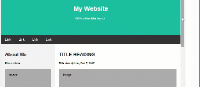
مثال هایی از Media Querie -وب سایت انعطاف پذیر
مثال : قالب وب سایت رسپانسیو
1 2 3 4 5 6 7 8 9 10 11 12 13 14 15 16 17 18 19 20 21 22 23 24 25 26 27 28 29 30 31 32 33 34 35 36 37 38 39 40 41 42 43 44 45 46 47 48 49 50 51 52 53 54 55 56 57 58 59 60 61 62 63 64 65 66 67 68 69 70 71 72 73 74 75 76 77 78 79 80 81 82 83 84 85 86 87 88 89 90 91 92 93 94 95 96 97 98 99 100 101 102 103 104 105 106 107 108 109 110 111 112 113 114 115 116 117 118 119 120 121 122 123 124 125 126 127 128 129 130 131 132 133 134 135 136 137 138 139 140 141 142 143 144 | <!DOCTYPE html> <html> <head> <title>Page Title</title> <meta charset="UTF-8"> <meta name="viewport" content="width=device-width, initial-scale=1"> <style> * { box-sizing: border-box; } /* Style the body */ body { font-family: Arial; margin: 0; } /* Header/logo Title */ .header { padding: 60px; text-align: center; background: #1abc9c; color: white; } /* Style the top navigation bar */ .navbar { display: flex; background-color: #333; } /* Style the navigation bar links */ .navbar a { color: white; padding: 14px 20px; text-decoration: none; text-align: center; } /* Change color on hover */ .navbar a:hover { background-color: #ddd; color: black; } /* Column container */ .row { display: flex; flex-wrap: wrap; } /* Create two unequal columns that sits next to each other */ /* Sidebar/left column */ .side { flex: 30%; background-color: #f1f1f1; padding: 20px; } /* Main column */ .main { flex: 70%; background-color: white; padding: 20px; } /* Fake image, just for this example */ .fakeimg { background-color: #aaa; width: 100%; padding: 20px; } /* Footer */ .footer { padding: 20px; text-align: center; background: #ddd; } /* Responsive layout - when the screen is less than 700px wide, make the two columns stack on top of each other instead of next to each other */ @media screen and (max-width: 700px) { .row, .navbar { flex-direction: column; } } </style> </head> <body> <!-- Note --> <div style="background:yellow;padding:5px"> <h4 style="text-align:center">Resize the browser window to see the responsive effect.</h4> </div> <!-- Header --> <div class="header"> <h1>My Website</h1> <p>With a <b>flexible</b> layout.</p> </div> <!-- Navigation Bar --> <div class="navbar"> <a href="#">Link</a> <a href="#">Link</a> <a href="#">Link</a> <a href="#">Link</a> </div> <!-- The flexible grid (content) --> <div class="row"> <div class="side"> <h2>About Me</h2> <h5>Photo of me:</h5> <div class="fakeimg" style="height:200px;">Image</div> <p>Some text about me in culpa qui officia deserunt mollit anim..</p> <h3>More Text</h3> <p>Lorem ipsum dolor sit ame.</p> <div class="fakeimg" style="height:60px;">Image</div><br> <div class="fakeimg" style="height:60px;">Image</div><br> <div class="fakeimg" style="height:60px;">Image</div> </div> <div class="main"> <h2>TITLE HEADING</h2> <h5>Title description, Dec 7, 2017</h5> <div class="fakeimg" style="height:200px;">Image</div> <p>Some text..</p> <p>Sunt in culpa qui officia deserunt mollit anim id est laborum consectetur adipiscing elit, sed do eiusmod tempor incididunt ut labore et dolore magna aliqua. Ut enim ad minim veniam, quis nostrud exercitation ullamco.</p> <br> <h2>TITLE HEADING</h2> <h5>Title description, Sep 2, 2017</h5> <div class="fakeimg" style="height:200px;">Image</div> <p>Some text..</p> <p>Sunt in culpa qui officia deserunt mollit anim id est laborum consectetur adipiscing elit, sed do eiusmod tempor incididunt ut labore et dolore magna aliqua. Ut enim ad minim veniam, quis nostrud exercitation ullamco.</p> </div> </div> <!-- Footer --> <div class="footer"> <h2>Footer</h2> </div> </body> </html> |
جهت گیری عمودی و افقی
با استفاده از Media querie می توانیم طراحی خاصی را بر اساس نوع orientation (جهت گیری) مرورگر تعریف کنیم.
در این مثال زمانیکه ارتفاع مرورگر از عرض آن بیشتر شده و حالت Landscape ایجاد شود رنگ پس زمینه تغییر می کند:
مثال : جهت گیری افقی و عمودی با media
| @media only screen and (orientation: landscape) { body { background-color: lightblue; } } |
اعمال در ویژگی های max-width و min-width
شما همچنین می توانید از ویژگی های (max-width: ..) and (min-width: ..) برای تعریف css در یک رنج اندازه ی مشخص استفاده کنید.
در مثال زیر وقتی که عرض صفحه نمایش در بازه ی ۹۰۰ تا ۶۰۰ پیکسل قرار بگیرد style تعریف شده اعمال می شود:
مثال : حداقل و حداکثر عرض
| @media screen and (max-width: 900px) and (min-width: 600px) { div.example { font-size: 50px; padding: 50px; border: 8px solid black; background: yellow; } } |
با استفاده از یک مقدار اضافی: در مثال زیر،به عبارت Media Querie مقادیر دیگر را اضافه می کنیم. (این عمل مانند یک اپراتور OR):
مثال : افزودن قوانین بیشتر به mediaquerie
| /* When the width is between 600px and 900px OR above 1100px - change the appearance of <div> */ @media screen and (max-width: 900px) and (min-width: 600px), (min-width: 1100px) { div.example { font-size: 50px; padding: 50px; border: 8px solid black; background: yellow; } } |
کلام آخر
در این جلسه سعی کردیم تا با ارائه ی مثال هایی از Media Querie از ساده ترین سطح آن تا سطوح کامل تر و گسترده تر ، شما را با کاربردها و استفاده های متعدد Media Querie در طراحی responsive آشنا کنیم.
 فروشگاه
 فیلم های آموزشی
 کتاب های آموزشی
 مقالات آموزشی
 وردپرس