مقدمه
با عرض سلام و وقت بخیر خدمت کاربران سایت پی وی لرن . و کاربرانی که دوره کامل آموزش CSS را دنبال می کنند. یکی از مطالب جدیدی که در سالهای اخیر به بحث طراحی وب اضافه شده است بحث Responsive کردن صفحات وب سایت هاست که با روش های مختلفی قابل انجام است که یکی از بهترین روش ها استفاده از ویژگی Flexbox در CSS می باشد. که اجازه ی قرار گرفتن عناصر به صورت افقی کنار هم با نظم خاصی را می دهد، همچنین به نسبت تغییر اندازه ی مرورگر نیز انعطاف پذیر بوده و ترتیب آن تنظیم می شود، برای آشنایی کامل با ساختار و ویژگی Flexbox در CSS در ادامه این بخش با ما همراه باشید.
ویژگی Flexbox در CSS
در ادامه ی این آموزش ما شما را با ساختار ویژگی Flexbox در CSS و جزئیات آن آشنا می کنیم.
ویژگی Flexbox در CSS
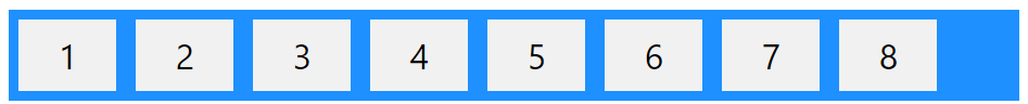
مثال : نمونه کامل استفاده از flex
1 2 3 4 5 6 7 8 9 10 11 12 13 14 15 16 17 18 19 20 21 22 23 24 25 26 27 28 29 30 31 32 33 34 35 36 37 38 39 40 | <!DOCTYPE html> <html> <head> <style> .flex-container { display: flex; flex-wrap: nowrap; background-color: DodgerBlue; } .flex-container > div { background-color: #f1f1f1; width: 100px; margin: 10px; text-align: center; line-height: 75px; font-size: 30px; } </style> </head> <body> <h1>Flexible Boxes</h1> <div class="flex-container"> <div>1</div> <div>2</div> <div>3</div> <div>4</div> <div>5</div> <div>6</div> <div>7</div> <div>8</div> </div> <p>Try to resize the browser window.</p> <p>A container with "flex-wrap: nowrap;" will never wrap its items.</p> <p><strong>Note:</strong> Flexbox is not supported in Internet Explorer 10 or earlier versions.</p> </body> </html> |
ماژول طراحی Flexbox
قبل از ماژول Flexbox Layout، چهار حالت طرح بندی وجود داشت:
- Block : برای تقسیم بندی داخلی وب سایت.
- Inline : برای متن ها.
- Table : برای داده های جدول دو بعدی.
- Positioned : برای موقعیت صریح یک عنصر.
ماژول Flexible Box با چیدمان افقی عناصر html بدون استفاده از ویژگی float ایجاد طرح های Responsive را آسان تر می کند.
پشتیبانی در مرورگرها
ویژگی های flexbox در مرورگرهای زیر پشتیبانی می شود:
| Chrome | Internet Explorer / Edge | Firefox | Safari | Opera |
|---|
| ۲۹٫۰ | ۱۱٫۰ | ۲۲٫۰ | ۱۰ | ۴۸ |
Flexbox در عناصر
برای شروع استفاده از مدل Flexbox، ابتدا باید یک ظرف انعطاف پذیر را تعریف کنید.
ویژگی Flexbox در CSS
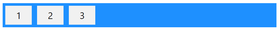
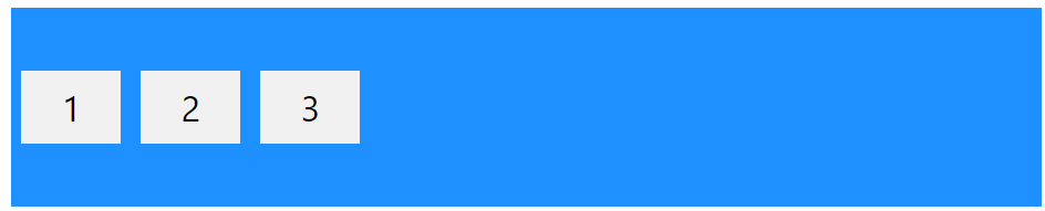
– ساختار اولیه
عنصر بالا یک عنصر انعطاف پذیر را به سه عدد داخل را نشان می دهد.
مثال : سینتکس اولیه flexbox
| <div class="flex-container"> <div>1</div> <div>2</div> <div>3</div> </div> |
عنصر والد
در ابتدا باید در عنصر ظرف یا والد ویژگی display را با مقدار flex تنظیم کنیم.
مثال :
| .flex-container { display: flex; } |
flex شامل مقادیر زیر می باشد:
- flex-direction
- flex-wrap
- flex-flow
- justify-content
- align-items
- align-content
ویژگی flex-direction
ویژگی flex-direction ترتیب جهت گیری عناصر داخل عنصر والد را مشخص می کند:
ویژگی Flexbox در CSS -جهت گیری
مثال : ویژگی flex-direction
| .flex-container { display: flex; flex-direction: column; } |
دسته بندی عمودی از پایین به بالا:
مثال : دسته بندی عمودی از پایین به بالا
| .flex-container { display: flex; flex-direction: column-reverse; } |
دسته بندی افقی چپ به راست:
مثال : دسته بندی افقی چپ به راست
| .flex-container { display: flex; flex-direction: row; } |
دسته بندی افقی – حالت راست به چپ:
مثال : دسته بندی افقی راست به چپ
| .flex-container { display: flex; flex-direction: row-reverse; } |
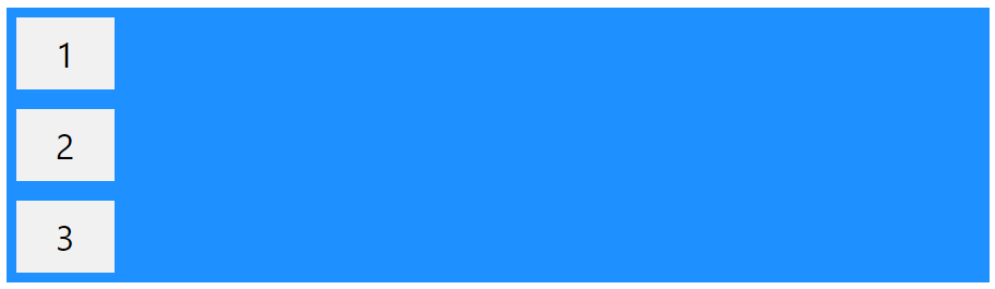
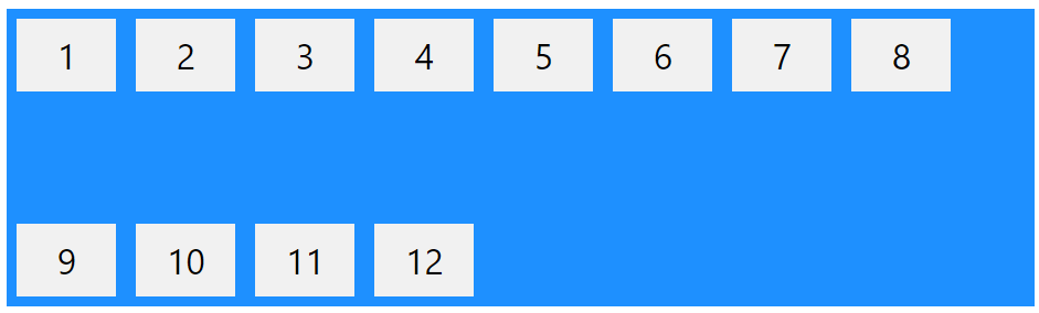
ویژگی flex-wrap
ویژگی flex-wrap مشخص کننده ی حالت قرارگیری آیتم ها با تغییر اندازه ی صفحه است:
در این مثال با استفاده از ویژگی flex-wrap یک flex با ۱۲ آیتم ایجاد کرده ایم:
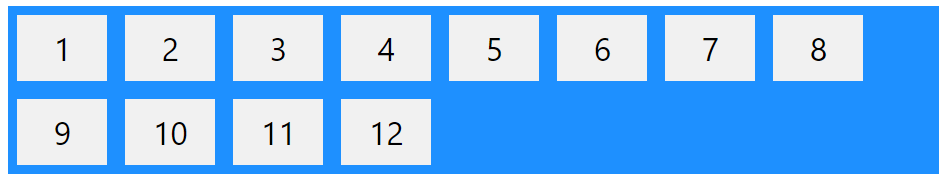
مثال : ویژگی flex-wrap با مقدار wrap
| .flex-container { display: flex; flex-wrap: wrap; }.flex-container { display: flex; flex-wrap: wrap; } |
حالت پیش فرض مقدار ویژگی flex-wrap برابر با nowrap است:
مثال : ویژگی flex-wrap با مقدار nowrap
| .flex-container { display: flex; flex-wrap: nowrap; } |
مقدار wrap-reverse در حالت responsive شدن مقادیر را به ترتیب معکوس می چیند.
مثال : ویژگی flex-wrap با مقدار wrap-reverse
| .flex-container { display: flex; flex-wrap: wrap-reverse; } |
ویژگی flex-flow
ویژگی flex-flow در واقع کوتاه شده ی دو ویژگی flex-direction و flex-wrap است و خصوصیات هر دو را داراست.
ویژگی justify-content
از ویژگی justify-content برای ترازبندی آیتم های flex استفاده می شود.

مثال : ویژگی justify-content
| .flex-container { display: flex; justify-content: center; } |
ویژگی flex-start آیتم های flex را در ابتدای عنصر والد ترازبندی می کند:
مثال : مقدار flex-start
| .flex-container { display: flex; justify-content: flex-start; } |
ویژگی flex-end آیتم های flex را در انتهای عنصر والد ترازبندی می کند:
مثال : مقدار flex-end
| .flex-container { display: flex; justify-content: flex-end; } |
مقدار space-around
مقدار space-around آیتم های flex را با فواصلی قبل ، بعد و بین خطوط نمایش می دهد:
مثال : مقدار space-around
| .flex-container { display: flex; justify-content: space-around; } |
مقدار space-between
مقدار space-between آیتم های flex را با فواصل بین خطوط آن ها نمایش می دهد.
مثال : مقدار between
| .flex-container { display: flex; justify-content: space-between; } |
ویژگی align-items
از ویژگی align-items برای ترازبندی عمودی آیتم های flex استفاده می شود.
در مثال های این ویژگی ما از یک عنصر ظرف با ارتفاع ۲۰۰ پیکسل استفاده می کنیم تا عملکرد این ویژگی را بهتر نشان دهیم.
مقدار center در این ویژگی عناصر flex را در وسط عنصر والد قرار می دهد:
مثال : خصوصیت align-items
| .flex-container { display: flex; height: 200px; align-items: center; } |
مقدار flex-start آیتم ها را در بخش بالای عنصر flex قرار می دهد:
مثال : مقدار flex-start
| .flex-container { display: flex; height: 200px; align-items: flex-start; } |
مقدار flex-end آیتم ها را در بخش پایینی عنصر flex قرار می دهد:
مثال : مقدار flex-end
| .flex-container { display: flex; height: 200px; align-items: flex-end; } |
مقدار stretch اندازه ی آیتم ها را امتداد می دهد تا عنصر flex را پر کند:
مثال : مقدار stretch
| .flex-container { display: flex; height: 200px; align-items: stretch; } |
مقدار baseline یک خط رنگی روی آیتم های flex قرار می دهد:
مثال : مقدار baseline
| .flex-container { display: flex; height: 200px; align-items: baseline; } |
خصوصیت align-content
ویژگی align-content برای ترازبندی خطوط flex استفاده می شود.
ما در مثال های این ویژگی از یک عنصر ظرف با اندازه ی ۶۰۰ پیکسل استفاده کرده ایم تا عملکرد این ویژگی را بخوبی نشان دهیم.
مقدار space-between در این ویژگی آیتم ها را با فضای فاصله مساوی بین آن ها نمایش می دهد:
مثال : خصوصیت align-content
| .flex-container { display: flex; height: 600px; flex-wrap: wrap; align-content: space-between; } |
مقدار space-around در ویژگی فوق خطوط flex را با فضای قبل ، بعد و بین آنها نمایش می دهد:
مثال : مقدار space-around
| .flex-container { display: flex; height: 600px; flex-wrap: wrap; align-content: space-around; } |
مقدار stretch در ویژگی فوق فضای باقی مانده را با خطوط flex پر می کند:
مثال : مقدار stretch
| .flex-container { display: flex; height: 600px; flex-wrap: wrap; align-content: stretch; } |
مقدار center در ویژگی فوق باعث نمایش خطوط flex در وسط عنصر والد می شود:
مثال : مقدار center
| .flex-container { display: flex; height: 600px; flex-wrap: wrap; align-content: center; } |
مقدار flex-start باعث نمایش خطوط flex در ابتدای عنصر والد می شود:
مثال : مقدار flex-start در align-content
| .flex-container { display: flex; height: 600px; flex-wrap: wrap; align-content: flex-start; } |
مقدار flex-end در ویژگی فوق باعث نمایش خطوط flex در انتهای عنصر والد می شود:
مثال : مقدار flex-end در align-content
| .flex-container { display: flex; height: 600px; flex-wrap: wrap; align-content: flex-end; } |
مرکزیت کامل
در مثال زیر ما یک مسئله بسیار رایج را حل می کنیم: مرکزیت کامل آیتم.

راه حل : مقدار هر دو ویژگی justify-content و align-items را center قرار دهید:
مثال : مقدار center
| .flex-container { display: flex; height: 300px; justify-content: center; align-items: center; } |
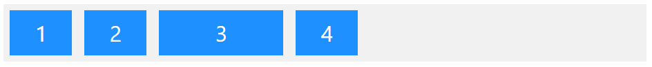
عناصر فرزند (آیتم ها)
عناصر فرزند مستقیم یک عنصر ظرف با قابلیت flex به طور خودکار قابلیت flex خواهند داشت.
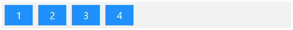
عنصر فوق چهار عنصر آبی انعطاف پذیر را درون عنصر ظرف خاکستری ظاهر می کند.
مثال : عناصر فرزند
| <div class="flex-container"> <div>1</div> <div>2</div> <div>3</div> <div>4</div> </div> |
ویژگی های آیتم های flex به شرح زیر است:
- order
- flex-grow
- flex-shrink
- flex-basis
- flex
- align-self
ویژگی order
ویژگی order ترتیب قرار گیری آیتم ها را مشخص می کند:
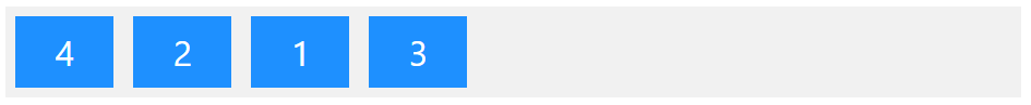
مقدار order که مشخص کننده اولویت نمایش آیتم است باید با عدد مشخص شود که پیش فرض آن ۰ است:
مثال : ویژگی order
| <div class="flex-container"> <div style="order: 3">1</div> <div style="order: 2">2</div> <div style="order: 4">3</div> <div style="order: 1">4</div> </div> |
ویژگی flex-grow
ویژگی flex-grow مشخص می کند که یک آیتم flex می تواند مابقی فضای خالی عنصر والد خود را پر کند.
مقدار این ویژگی باید با یک عدد مشخص شود که پیش فرض آن ۰ است.
مثال : ویژگی flex-grow
| <div class="flex-container"> <div style="flex-grow: 1">1</div> <div style="flex-grow: 1">2</div> <div style="flex-grow: 8">3</div> </div> |
ویژگی flex-shrink
این ویژگی میزان انعطاف پذیری یک آیتم را نسبت به سایر آیتم ها تعیین می کند.
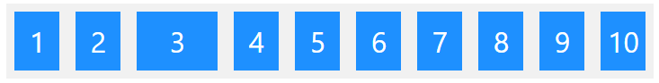
مقدار این ویژگی باید با یک عدد مشخص که پیش فرض آن ۱ است.
در مثال زیر انعطاف پذیری آیتم سوم را نسبت به بقیه کاهش می دهیم:
مثال : ویژگی flex-shrink
| <div class="flex-container"> <div>1</div> <div>2</div> <div style="flex-shrink: 0">3</div> <div>4</div> <div>5</div> <div>6</div> <div>7</div> <div>8</div> <div>9</div> <div>10</div> </div> |
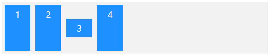
ویژگی flex-basis
ویژگی flex-basis طول داخلی یک آیتم flex را تعیین می کند.
در مثال زیر طول آیتم سوم را تا ۲۰۰ پیکسل افزایش می دهیم:
مثال : ویژگی flex-basis
| <div class="flex-container"> <div>1</div> <div>2</div> <div style="flex-basis: 200px">3</div> <div>4</div> </div> |
ویژگی flex
این ویژگی کوتاه شده ی ویژگی های flex-grow, flex-shrink و flex-basis است.
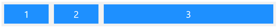
در مثال زیر برای آیتم سوم ویژگی های growable و shrinkable را حذف کرده و طول داخلی آیتم را با ۲۰۰ پیکسل تنظیم می کنیم.
مثال : ویژگی flexbox_flex
| <div class="flex-container"> <div>1</div> <div>2</div> <div style="flex: 0 0 200px">3</div> <div>4</div> </div> |
ویژگی align-self
خصوصیات align-self تراز برای آیتم انتخاب شده داخل عنصر والد انعطاف پذیری را مشخص می کند.
ویژگی align-self ترازبندی پیش فرض را با تنظیم ویژگی align-items از عنصر والد اعمال می کند.
در این نمونه ها از یک عنصر والد ۲۰۰ پیکسل بالا استفاده می کنیم تا بهتر بتوانیم خصوصیات align-self را نشان دهیم:
در مثال زیر آیتم سوم را در وسط عنصر والد خود تراز می کنیم:
مثال : مقدار align-self
| <div class="flex-container"> <div>1</div> <div>2</div> <div style="align-self: center">3</div> <div>4</div> </div> |
تنظیم آیتم دوم در بالای عنصر والد و عنصر سوم در پایین عنصر والد:
مثال : مقدار flex
| <div class="flex-container"> <div>1</div> <div style="align-self: flex-start">2</div> <div style="align-self: flex-end">3</div> <div>4</div> </div> |
ایجاد یک گالری عکس responsive با قابلیت flexbox
در نهایت یک نمونه گالری عکس responsive ایجاد می کنیم که به نسب اندازه مرورگر تنظیم شود:
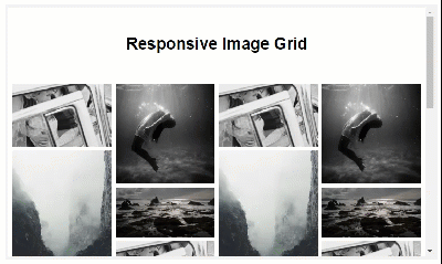
مثال : گالری عکس در image_gallery
1 2 3 4 5 6 7 8 9 10 11 12 13 14 15 16 17 18 19 20 21 22 23 24 25 26 27 28 29 30 31 32 33 34 35 36 37 38 39 40 41 42 43 44 45 46 47 48 49 50 51 52 53 54 55 56 57 58 59 60 61 62 63 64 65 66 67 68 69 70 71 72 73 74 75 76 77 78 79 80 81 82 83 84 85 86 87 88 89 90 91 92 93 94 95 96 97 98 99 100 101 102 | <!DOCTYPE html> <html> <style> * { box-sizing: border-box; } body { margin: 0; font-family: Arial; } .header { text-align: center; padding: 32px; } .row { display: flex; flex-wrap: wrap; padding: 0 4px; } /* Create four equal columns that sits next to each other */ .column { flex: 25%; max-width: 25%; padding: 0 4px; } .column img { margin-top: 8px; vertical-align: middle; } /* Responsive layout - makes a two column-layout instead of four columns */ @media (max-width: 800px) { .column { flex: 50%; max-width: 50%; } } /* Responsive layout - makes the two columns stack on top of each other instead of next to each other */ @media (max-width: 600px) { .column { flex: 100%; max-width: 100%; } } </style> <body> <!-- Header --> <div class="header"> <h1>Responsive Image Grid</h1> <p>Resize the browser window to see the responsive effect.</p> </div> <!-- Photo Grid --> <div class="row"> <div class="column"> <img src="/w3images/wedding.jpg" style="width:100%"> <img src="/w3images/rocks.jpg" style="width:100%"> <img src="/w3images/falls2.jpg" style="width:100%"> <img src="/w3images/paris.jpg" style="width:100%"> <img src="/w3images/nature.jpg" style="width:100%"> <img src="/w3images/mist.jpg" style="width:100%"> <img src="/w3images/paris.jpg" style="width:100%"> </div> <div class="column"> <img src="/w3images/underwater.jpg" style="width:100%"> <img src="/w3images/ocean.jpg" style="width:100%"> <img src="/w3images/wedding.jpg" style="width:100%"> <img src="/w3images/mountainskies.jpg" style="width:100%"> <img src="/w3images/rocks.jpg" style="width:100%"> <img src="/w3images/underwater.jpg" style="width:100%"> </div> <div class="column"> <img src="/w3images/wedding.jpg" style="width:100%"> <img src="/w3images/rocks.jpg" style="width:100%"> <img src="/w3images/falls2.jpg" style="width:100%"> <img src="/w3images/paris.jpg" style="width:100%"> <img src="/w3images/nature.jpg" style="width:100%"> <img src="/w3images/mist.jpg" style="width:100%"> <img src="/w3images/paris.jpg" style="width:100%"> </div> <div class="column"> <img src="/w3images/underwater.jpg" style="width:100%"> <img src="/w3images/ocean.jpg" style="width:100%"> <img src="/w3images/wedding.jpg" style="width:100%"> <img src="/w3images/mountainskies.jpg" style="width:100%"> <img src="/w3images/rocks.jpg" style="width:100%"> <img src="/w3images/underwater.jpg" style="width:100%"> </div> </div> </body> </html> |
Responsive کردن قالب وب سایت با استفاده از flexbox
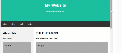
مثال : قالب وب سایترسپانسیو
1 2 3 4 5 6 7 8 9 10 11 12 13 14 15 16 17 18 19 20 21 22 23 24 25 26 27 28 29 30 31 32 33 34 35 36 37 38 39 40 41 42 43 44 45 46 47 48 49 50 51 52 53 54 55 56 57 58 59 60 61 62 63 64 65 66 67 68 69 70 71 72 73 74 75 76 77 78 79 80 81 82 83 84 85 86 87 88 89 90 91 92 93 94 95 96 97 98 99 100 101 102 103 104 105 106 107 108 109 110 111 112 113 114 115 116 117 118 119 120 121 122 123 124 125 126 127 128 129 130 131 132 133 134 135 136 137 138 139 140 141 142 143 144 | <!DOCTYPE html> <html> <head> <title>Page Title</title> <meta charset="UTF-8"> <meta name="viewport" content="width=device-width, initial-scale=1"> <style> * { box-sizing: border-box; } /* Style the body */ body { font-family: Arial; margin: 0; } /* Header/logo Title */ .header { padding: 60px; text-align: center; background: #1abc9c; color: white; } /* Style the top navigation bar */ .navbar { display: flex; background-color: #333; } /* Style the navigation bar links */ .navbar a { color: white; padding: 14px 20px; text-decoration: none; text-align: center; } /* Change color on hover */ .navbar a:hover { background-color: #ddd; color: black; } /* Column container */ .row { display: flex; flex-wrap: wrap; } /* Create two unequal columns that sits next to each other */ /* Sidebar/left column */ .side { flex: 30%; background-color: #f1f1f1; padding: 20px; } /* Main column */ .main { flex: 70%; background-color: white; padding: 20px; } /* Fake image, just for this example */ .fakeimg { background-color: #aaa; width: 100%; padding: 20px; } /* Footer */ .footer { padding: 20px; text-align: center; background: #ddd; } /* Responsive layout - when the screen is less than 700px wide, make the two columns stack on top of each other instead of next to each other */ @media screen and (max-width: 700px) { .row, .navbar { flex-direction: column; } } </style> </head> <body> <!-- Note --> <div style="background:yellow;padding:5px"> <h4 style="text-align:center">Resize the browser window to see the responsive effect.</h4> </div> <!-- Header --> <div class="header"> <h1>My Website</h1> <p>With a <b>flexible</b> layout.</p> </div> <!-- Navigation Bar --> <div class="navbar"> <a href="#">Link</a> <a href="#">Link</a> <a href="#">Link</a> <a href="#">Link</a> </div> <!-- The flexible grid (content) --> <div class="row"> <div class="side"> <h2>About Me</h2> <h5>Photo of me:</h5> <div class="fakeimg" style="height:200px;">Image</div> <p>Some text about me in culpa qui officia deserunt mollit anim..</p> <h3>More Text</h3> <p>Lorem ipsum dolor sit ame.</p> <div class="fakeimg" style="height:60px;">Image</div><br> <div class="fakeimg" style="height:60px;">Image</div><br> <div class="fakeimg" style="height:60px;">Image</div> </div> <div class="main"> <h2>TITLE HEADING</h2> <h5>Title description, Dec 7, 2017</h5> <div class="fakeimg" style="height:200px;">Image</div> <p>Some text..</p> <p>Sunt in culpa qui officia deserunt mollit anim id est laborum consectetur adipiscing elit, sed do eiusmod tempor incididunt ut labore et dolore magna aliqua. Ut enim ad minim veniam, quis nostrud exercitation ullamco.</p> <br> <h2>TITLE HEADING</h2> <h5>Title description, Sep 2, 2017</h5> <div class="fakeimg" style="height:200px;">Image</div> <p>Some text..</p> <p>Sunt in culpa qui officia deserunt mollit anim id est laborum consectetur adipiscing elit, sed do eiusmod tempor incididunt ut labore et dolore magna aliqua. Ut enim ad minim veniam, quis nostrud exercitation ullamco.</p> </div> </div> <!-- Footer --> <div class="footer"> <h2>Footer</h2> </div> </body> </html> |
خصوصیات ویژگی flex
| ویژگی | توضیحات |
|---|
| display | نوع box مورد استفاده برای یک عنصر HTML را مشخص می کند. |
| flex-direction | جهت اجزای انعطاف پذیر را در یک ظرف انعطاف پذیر را مشخص می کند. |
| justify-content | محتوای عنصر flex را در مرکز قرار می دهد. |
| align-items | آیتم های عنصر flex را به صورت عمودی ترتیب می دهد. |
| flex-wrap | ویژگی responsive را به عنصر flex ارائه می دهد. |
| align-content | با استفاده از خطوط flex آیتم های آن را ترازبندی می کند. |
| flex-flow | کوتاه شده ی دو ویژگی flex-direction و flex-wrap است. |
| order | ترتیب یک آیتم flex را نسبت به بقیه موارد flex در داخل یک عنصر ظرف مشخص می کند. |
| align-self | انعطاف پذیری آیتم های flex را تغییر می دهد. |
| flex | کوتاه شده ی سه ویژگی flex-grow, flex-shrink و flex-basis است. |
کلام آخر
خصوصیات ویژگی Flexbox در CSS یکی از موارد مهم و کامل برای ایجاد صفحات responsive در وب سایت می باشد. با این ویژگی ها دیگر نیازی به تنظیمات دستی عرض و ارتفاع عناصر برای حالت responsive ندارید.
 فروشگاه
 فیلم های آموزشی
 کتاب های آموزشی
 مقالات آموزشی
 وردپرس