مقدمه
با عرض سلام و وقت بخیر خدمت کاربران سایت پی وی لرن . و کاربرانی که دوره کامل آموزش Bootstrap 4 ، را دنبال می کنند. خب در جلسات قبلی ما به طراحی های عناصر آماده ای که در اغلب سایت ها، استفاده می شود. پرداختیم. در این بخش از دوره ، قصد داریم به یک موضوع جدید در Bootstrap 4، بپردازیم. ما در این جلسه به موضوع طراحی کارت ها در Bootstrap 4 و بررسی ویژگی card ، می پردازیم.
کسانی که در جریان جلسات اخیر این دوره قرار نگرفته اند. برای بررسی آن، مباحث pagination در Bootstrap 4 و موضوع لیست های گروه بندی در Bootstrap 4 ، را بررسی کنند.
خب در ادامه این بخش ، وارد مبحث طراحی کارت ها در Bootstrap 4 و بررسی ویژگی card ، خواهیم شد.
cards – طراحی کارت ها در Bootstrap 4 – بررسی ویژگی card
طراحی کارت ها در Bootstrap 4 و بررسی ویژگی card
ویژگی card ، یک box خط و مرز دار، با کمی فاصله از محتوای اطراف آن را در Bootstrap 4 ، توصیف می کند.
طراحی کارت ها در Bootstrap 4 – بررسی ویژگی card
طراحی پایه کارت
در طراحی پایه ، از کلاس .card و یک محتوا داخل آن با کلاس .card-body ، استفاده شده است.
مثال:
مثال :
| <div class="card"> <div class="card-body">Basic card</div> </div> |
سرصفحه و پاصفحه
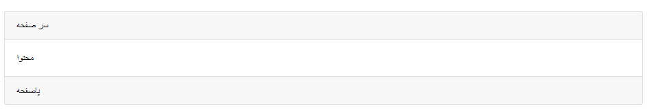
سرصفحه و پاصفحه
برای افزودن سر صفحه و پا صفحه به ابتدا و انتهای طراحی کارت ، کلاس های .card-header را به آیتم ابتدا و .card-footer ر ابه آیتم انتهای کارت اضافه کنید:
مثال :
| <div class="card"> <div class="card-header">Header</div> <div class="card-body">Content</div> <div class="card-footer">Footer</div> </div> |
استفاده از کلاس های متنی
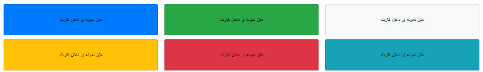
برای افزودن رنگ پس زمینه به هر کدام از آیتم ها، از کلاس های متنی (.bg-primary, .bg-success, .bg-info, .bg-warning, .bg-danger, .bg-secondary, .bg-dark و .bg-light.) ، استفاده کنید.
مثال:
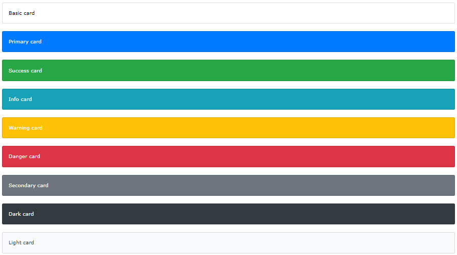
استفاده از کلاس های متنی – بررسی ویژگی card
افزودن متن ، عنوان و لینک
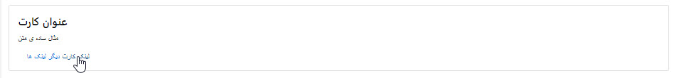
افزودن متن ، عنوان و لینک
از کلاس .card-title ، برای افزودن عنوان در سربرگ ها در کارت ، از کلاس .card-text ، نیز برای قرار دادن متن در card و از کلاس .card-link ، برای ایحاد لینک، استفاده کنید. تمامی این کلاس ها باید در تگ <div> ، با کلاس .card-body ، قرار بگیرد.
مثال:
مثال :
| <div class="card"> <div class="card-body"> <h4 class="card-title">Card title</h4> <p class="card-text">Some example text. Some example text.</p> <a href="#" class="card-link">Card link</a> <a href="#" class="card-link">Another link</a> </div> </div> |
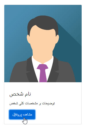
کارت عکس دار
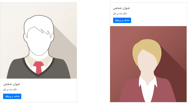
کارت عکس دار
برای افزودن یک عکس در بخش بالای کارت کلاس .card-img-top و برای بخش پایین کارت کلاس .card-img-bottom ر ابه یک تگ <img> ، در کارت اضافه کنید. لازم به ذکر است، که موارد فوق خارج از کلاس .card-body ، باید تعریف شود.
مثال:
مثال :
| <div class="card" style="width:400px"> <img class="card-img-top" src="img_avatar1.png" alt="Card image"> <div class="card-body"> <h4 class="card-title">John Doe</h4> <p class="card-text">Some example text.</p> <a href="#" class="btn btn-primary">See Profile</a> </div> </div> |
افزودن متن روی عکس card
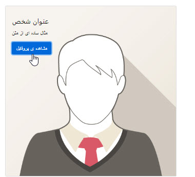
افزودن متن روی عکس card – بررسی ویژگی card
برای افزودن متن ، روی عکس کارت، از کلاس .card-img-overlay در تگ <div> ، استفاده کنید.
مثال:
مثال :
| <div class="card" style="width:500px"> <img class="card-img-top" src="img_avatar1.png" alt="Card image"> <div class="card-img-overlay"> <h4 class="card-title">John Doe</h4> <p class="card-text">Some example text.</p> <a href="#" class="btn btn-primary">See Profile</a> </div> </div> |
کارت های ستونی
کارت های ستونی
برای اینکار ، می توانید از کلاس .card-columns به عنوان یک ظرف برای نگهداری آیتم های فوق ، استفاده کنید.
نکته: این آیتم ها در صفحه نمایش های کمتر از ۵۷۶px ، بصورت عمودی نمایش داده می شود.
مثال :
1 2 3 4 5 6 7 8 9 10 11 12 13 14 15 16 17 18 19 20 21 22 23 24 25 26 27 28 29 30 31 32 | <div class="card-columns"> <div class="card bg-primary"> <div class="card-body text-center"> <p class="card-text">Some text inside the first card</p> </div> </div> <div class="card bg-warning"> <div class="card-body text-center"> <p class="card-text">Some text inside the second card</p> </div> </div> <div class="card bg-success"> <div class="card-body text-center"> <p class="card-text">Some text inside the third card</p> </div> </div> <div class="card bg-danger"> <div class="card-body text-center"> <p class="card-text">Some text inside the fourth card</p> </div> </div> <div class="card bg-light"> <div class="card-body text-center"> <p class="card-text">Some text inside the fifth card</p> </div> </div> <div class="card bg-info"> <div class="card-body text-center"> <p class="card-text">Some text inside the sixth card</p> </div> </div> </div> |
حالت دیگری از این ویژگی :
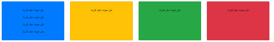
حالت دیگر
نکته: این آیتم ها در صفحه نمایش های کمتر از ۵۷۶px ، بصورت عمودی نمایش داده می شود.
مثال:
مثال :
1 2 3 4 5 6 7 8 9 10 11 12 13 14 15 16 17 18 19 20 21 22 | <div class="card-deck"> <div class="card bg-primary"> <div class="card-body text-center"> <p class="card-text">Some text inside the first card</p> </div> </div> <div class="card bg-warning"> <div class="card-body text-center"> <p class="card-text">Some text inside the second card</p> </div> </div> <div class="card bg-success"> <div class="card-body text-center"> <p class="card-text">Some text inside the third card</p> </div> </div> <div class="card bg-danger"> <div class="card-body text-center"> <p class="card-text">Some text inside the fourth card</p> </div> </div> </div> |
گروه بندی حالت فوق:
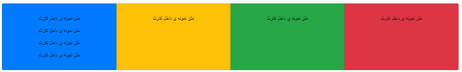
گروه بندی کارتها
برای اینکار از کلاس .card-group به جای .card-deck ، استفاده کنید.
نکته: این آیتم ها در صفحه نمایش های کمتر از ۵۷۶px ، بصورت عمودی نمایش داده می شود.
مثال:
مثال :
1 2 3 4 5 6 7 8 9 10 11 12 13 14 15 16 17 18 19 20 21 22 | <div class="card-group"> <div class="card bg-primary"> <div class="card-body text-center"> <p class="card-text">Some text inside the first card</p> </div> </div> <div class="card bg-warning"> <div class="card-body text-center"> <p class="card-text">Some text inside the second card</p> </div> </div> <div class="card bg-success"> <div class="card-body text-center"> <p class="card-text">Some text inside the third card</p> </div> </div> <div class="card bg-danger"> <div class="card-body text-center"> <p class="card-text">Some text inside the fourth card</p> </div> </div> </div> |
کلام آخر
در ادامه مباحث ، در این جلسه ما یک طراحی جدید را در Bootstrap 4 ، بررسی کردیم. و این قابلیت را تحت عنوان موضوع طراحی کارت ها در Bootstrap 4 و بررسی ویژگی card ، در این جلسه برای شما ارائه کردیم. امیدورایم که مطالب فوق ، مور توجه و استفاده شما قرار گرفته باشد.
 فروشگاه
 فیلم های آموزشی
 کتاب های آموزشی
 مقالات آموزشی
 وردپرس