مقدمه
با عرض سلام خدمت کاربران سایت پی وی لرن . ما در بخش دوره کامل آموزش css ، به طراحی کلی قالب صفحات وب ، اشاره کردیم. و توضیحاتی در این مورد ، در بخش آموزش css ، ارائه کردیم. اکنون در ادامه آموزشهای کامل html، در این بخش قصد داریم به موضوع آشنایی با طرح های کلی قالب وب سایت یا طراحی قالب وب سایت ، بپردازیم.
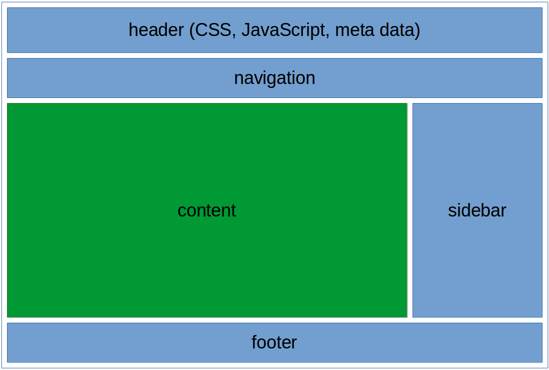
وب سایت های معمولا محتوای خود را در چندین ستون (مانند مجله ها و روزنامه ها) نمایش می دهند. در html5 یک شماتیک کلی برای قالب وب سایت ، ارائه شده است. که در ادامه این آموزش به آن می پردازیم.
Layout در طراحی قالب وب سایت
آشنایی با طرح های کلی قالب وب سایت
طرح کلی که html5 برای قالب وب سایت ارائه کرده است ، بصورت زیر است:
design
مثال:
مثال : قالب وب سایت
1 2 3 4 5 6 7 8 9 10 11 12 13 14 15 16 17 18 19 20 21 22 23 24 25 26 27 28 29 30 31 32 33 34 35 36 37 38 39 40 41 42 43 44 45 46 47 48 49 50 51 52 53 54 55 56 57 58 59 60 61 62 63 64 65 66 67 68 69 70 71 72 73 74 75 76 77 78 79 80 81 82 83 84 85 86 87 88 89 90 91 92 93 94 95 96 97 98 99 100 101 102 103 | <!DOCTYPE html> <html lang="en"> <head> <title>CSS Template</title> <meta charset="utf-8"> <meta name="viewport" content="width=device-width, initial-scale=1"> <style> * { box-sizing: border-box; } body { font-family: Arial, Helvetica, sans-serif; } /* Style the header */ header { background-color: #666; padding: 30px; text-align: center; font-size: 35px; color: white; } /* Create two columns/boxes that floats next to each other */ nav { float: left; width: 30%; height: 300px; /* only for demonstration, should be removed */ background: #ccc; padding: 20px; } /* Style the list inside the menu */ nav ul { list-style-type: none; padding: 0; } article { float: left; padding: 20px; width: 70%; background-color: #f1f1f1; height: 300px; /* only for demonstration, should be removed */ } /* Clear floats after the columns */ section:after { content: ""; display: table; clear: both; } /* Style the footer */ footer { background-color: #777; padding: 10px; text-align: center; color: white; } /* Responsive layout - makes the two columns/boxes stack on top of each other instead of next to each other, on small screens */ @media (max-width: 600px) { nav, article { width: 100%; height: auto; } } </style> </head> <body> <h2>CSS Layout Float</h2> <p>In this example, we have created a header, two columns/boxes and a footer. On smaller screens, the columns will stack on top of each other.</p> <p>Resize the browser window to see the responsive effect (you will learn more about this in our next chapter - HTML Responsive.)</p> <header> <h2>Cities</h2> </header> <section> <nav> <ul> <li><a href="#">London</a></li> <li><a href="#">Paris</a></li> <li><a href="#">Tokyo</a></li> </ul> </nav> <article> <h1>London</h1> <p>London is the capital city of England. It is the most populous city in the United Kingdom, with a metropolitan area of over 13 million inhabitants.</p> <p>Standing on the River Thames, London has been a major settlement for two millennia, its history going back to its founding by the Romans, who named it Londinium.</p> </article> </section> <footer> <p>Footer</p> </footer> </body> </html> |
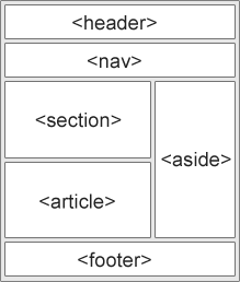
- <header> : یک سربرگ برای صفحه وب تعریف می کند.
- <nav> : ظرفی برای نگهداری لینک های navigation است.
- <section> : بخشی از یک سند را تعریف می کند.
- <article> : یک مقاله مستقل را در صفحه وب تعریف می کند.
- <aside> : محتوای حاشیه ی وب سایت را تعریف می کند.
- <footer> : پانوشته ی یک صفحه وب است.
- <details> : جزئیات را مشخص می کند.
- <summary> : به عنوان یک سربرگ برای جزئیات عمل می کند.
تکنیک های طرح بندی قالب html
۵ روش کلی برای ایجاد طرح های چند ستونی در قالب وب سایت ، وجود دارد، که هر کدام دارای مزایای و معایبی می باشد:
- HTML tables (توصیه نمی شود)
- CSS float property
- CSS flexbox
- CSS framework
اکنون به بررسی هر کدام از این روشها می پردازیم:
روش HTML tables
تگ <table> در html در واقع برای ایجاد طرح قالب وب سایت ،ارائه نشده است. هدف اصلی استفاده از تگ <table> ، در واقع نمایش جدولی داده ها است. بنابراین سعی کنید از جداول برای طراحی قالب وب سایت خود استفاده نکنید! چراکه باعث افزایش حجم کد وب سایت شما شده و اگر بخواهید بعدا طرح وب سایت خود را تغییر بدهید، دچار مشکلاتی می شوید.
روش CSS framework
اگر شما می خواهید که قالب وب سایت خود را سریع طراحی کنید ، می توانید از فریم ورک های آماده ی وب سایت نظیر W3.CSS و Bootstrap استفاده کنید.
روش CSS float
این یک روش کلی برای طراحی قالب کلی وب سایت است. این روش برای یادگیری آسان است. شما فقط باید یاد بگیرید که خصوصیات float و clear ، چه طور کار می کنند.
مثال : استفاده از صفت float
1 2 3 4 5 6 7 8 9 10 11 12 13 14 15 16 17 18 19 20 21 22 23 24 25 26 27 28 29 30 31 32 33 34 35 36 37 38 39 40 41 42 43 44 45 46 47 48 49 50 51 52 53 54 55 56 57 58 59 60 61 62 63 64 65 66 67 68 69 70 71 72 73 74 75 76 77 78 79 80 81 82 83 84 85 86 87 88 89 90 91 92 93 94 95 96 97 98 99 100 101 102 103 | <!DOCTYPE html> <html lang="en"> <head> <title>CSS Template</title> <meta charset="utf-8"> <meta name="viewport" content="width=device-width, initial-scale=1"> <style> * { box-sizing: border-box; } body { font-family: Arial, Helvetica, sans-serif; } /* Style the header */ header { background-color: #666; padding: 30px; text-align: center; font-size: 35px; color: white; } /* Create two columns/boxes that floats next to each other */ nav { float: left; width: 30%; height: 300px; /* only for demonstration, should be removed */ background: #ccc; padding: 20px; } /* Style the list inside the menu */ nav ul { list-style-type: none; padding: 0; } article { float: left; padding: 20px; width: 70%; background-color: #f1f1f1; height: 300px; /* only for demonstration, should be removed */ } /* Clear floats after the columns */ section:after { content: ""; display: table; clear: both; } /* Style the footer */ footer { background-color: #777; padding: 10px; text-align: center; color: white; } /* Responsive layout - makes the two columns/boxes stack on top of each other instead of next to each other, on small screens */ @media (max-width: 600px) { nav, article { width: 100%; height: auto; } } </style> </head> <body> <h2>CSS Layout Float</h2> <p>In this example, we have created a header, two columns/boxes and a footer. On smaller screens, the columns will stack on top of each other.</p> <p>Resize the browser window to see the responsive effect (you will learn more about this in our next chapter - HTML Responsive.)</p> <header> <h2>Cities</h2> </header> <section> <nav> <ul> <li><a href="#">London</a></li> <li><a href="#">Paris</a></li> <li><a href="#">Tokyo</a></li> </ul> </nav> <article> <h1>London</h1> <p>London is the capital city of England. It is the most populous city in the United Kingdom, with a metropolitan area of over 13 million inhabitants.</p> <p>Standing on the River Thames, London has been a major settlement for two millennia, its history going back to its founding by the Romans, who named it Londinium.</p> </article> </section> <footer> <p>Footer</p> </footer> </body> </html> |
روش Flexbox
Flexbox یه طرح جدید است که در css3 ایجاد شده است. این روش تضمین می کند که رفتار قالب وب سایت ، در وضعیت های مختلف قابل پیش بینی باشد.(زمانیکه صفحه نمایش در دستگاههایی با اندازه های مختلف اجرا می شود).
مثال : استفاده از flex
1 2 3 4 5 6 7 8 9 10 11 12 13 14 15 16 17 18 19 20 21 22 23 24 25 26 27 28 29 30 31 32 33 34 35 36 37 38 39 40 41 42 43 44 45 46 47 48 49 50 51 52 53 54 55 56 57 58 59 60 61 62 63 64 65 66 67 68 69 70 71 72 73 74 75 76 77 78 79 80 81 82 83 84 85 86 87 88 89 90 91 92 93 94 95 96 97 98 99 100 101 102 103 104 | <!DOCTYPE html> <html lang="en"> <head> <title>CSS Template</title> <meta charset="utf-8"> <meta name="viewport" content="width=device-width, initial-scale=1"> <style> * { box-sizing: border-box; } body { font-family: Arial, Helvetica, sans-serif; } /* Style the header */ header { background-color: #666; padding: 30px; text-align: center; font-size: 35px; color: white; } /* Container for flexboxes */ section { display: -webkit-flex; display: flex; } /* Style the navigation menu */ nav { -webkit-flex: 1; -ms-flex: 1; flex: 1; background: #ccc; padding: 20px; } /* Style the list inside the menu */ nav ul { list-style-type: none; padding: 0; } /* Style the content */ article { -webkit-flex: 3; -ms-flex: 3; flex: 3; background-color: #f1f1f1; padding: 10px; } /* Style the footer */ footer { background-color: #777; padding: 10px; text-align: center; color: white; } /* Responsive layout - makes the menu and the content (inside the section) sit on top of each other instead of next to each other */ @media (max-width: 600px) { section { -webkit-flex-direction: column; flex-direction: column; } } </style> </head> <body> <h2>CSS Layout Flexbox</h2> <p>In this example, we have created a header, two columns/boxes and a footer. On smaller screens, the columns will stack on top of each other.</p> <p>Resize the browser window to see the responsive effect.</p> <p><strong>Note:</strong> Flexbox is not supported in Internet Explorer 10 eand earlier versions.</p> <header> <h2>Cities</h2> </header> <section> <nav> <ul> <li><a href="#">London</a></li> <li><a href="#">Paris</a></li> <li><a href="#">Tokyo</a></li> </ul> </nav> <article> <h1>London</h1> <p>London is the capital city of England. It is the most populous city in the United Kingdom, with a metropolitan area of over 13 million inhabitants.</p> <p>Standing on the River Thames, London has been a major settlement for two millennia, its history going back to its founding by the Romans, who named it Londinium.</p> </article> </section> <footer> <p>Footer</p> </footer> </body> </html> |
استفاده از Grid در CSS
ماژول CSS Grid یک سیستم طرح بندی مبتنی بر شبکه با ردیف ها و ستون ها را ارائه می دهد که ساده تر ساختن صفحات وب را بدون نیاز به استفاده از float ها و position ها انجام می دهد.
کلام آخر
تاکنون شما را با برخی از عناصر مهم HTML ، صفات عناصر ، کدنویسی CSS و کمی جاوا اسکریپت آشنا کردیم، تا اینجای کار شما می توانید همانطور که در مباحث فوق اشاره کردیم قالب کلی و ساده ی صفحات HTML را پیاده سازی کنید.
در بخش های بعدی شما را با مباحث بیشتری از طراحی قالب وب سایت آشنا خواهیم کرد.
 فروشگاه
 فیلم های آموزشی
 کتاب های آموزشی
 مقالات آموزشی
 وردپرس